Real Estate Agents

Dominate your local real estate market with these proven strategies.

WEBSITES FOR REAL ESTATE AGENTS

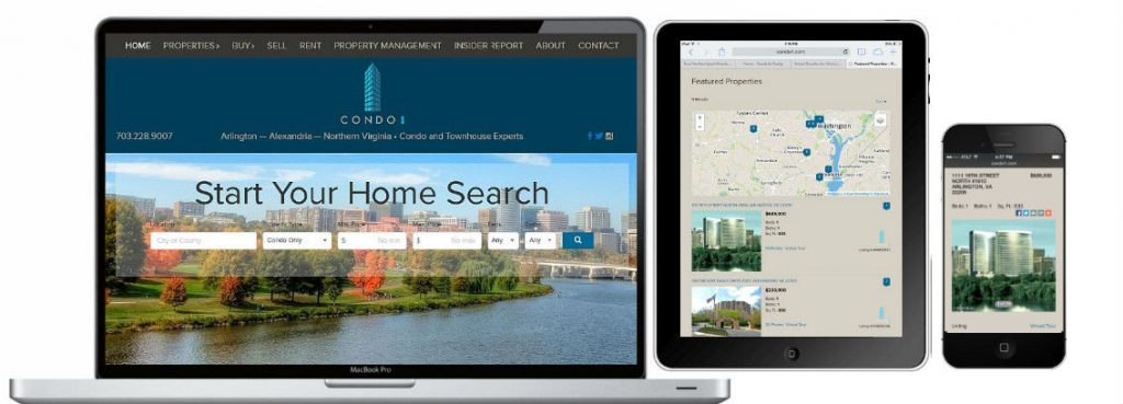
Responsive WordPress Websites with integrated IDX
Responsive — NOT just mobile-friendly.
This is the absolute foundation of your online marketing. If your website is not built in WordPress or is not responsive or mobile-friendly, you must fix it today. Visitors come to search properties so IDX-integration is a must.

Give sellers a reason to list with you.

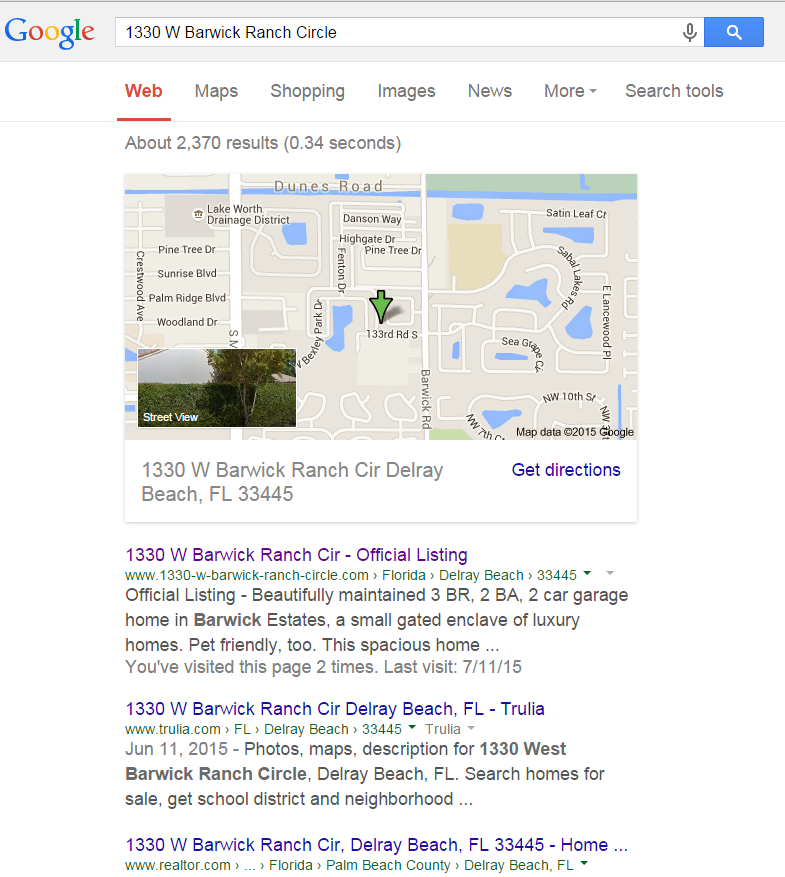
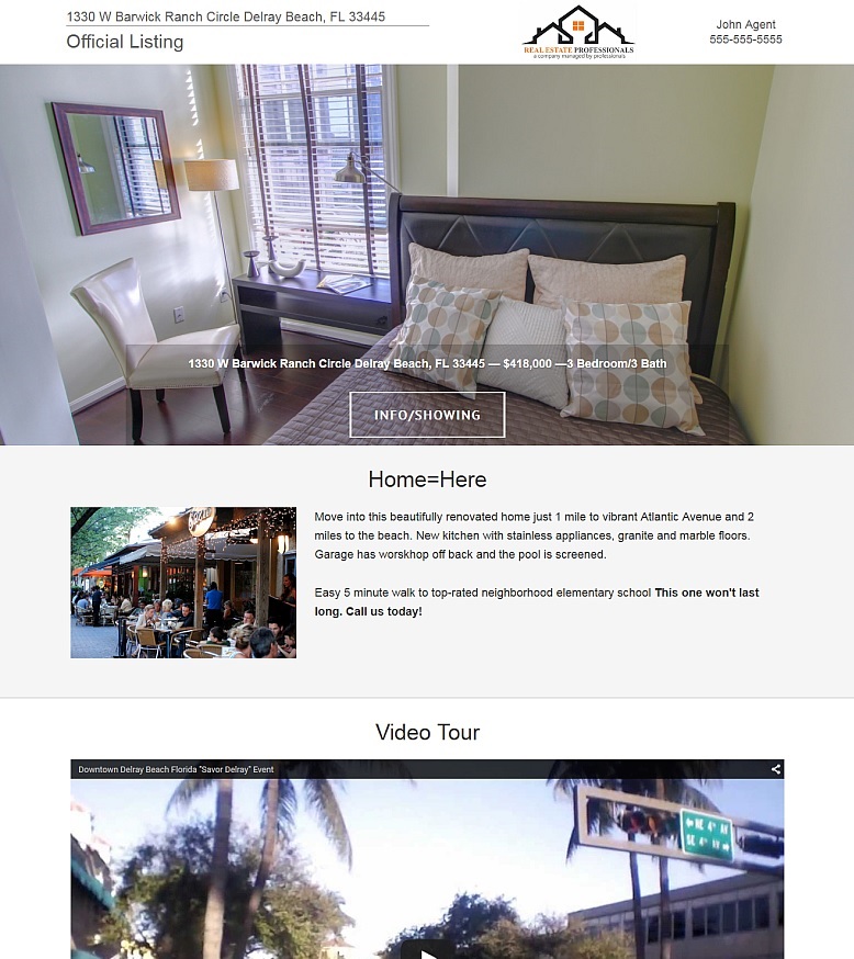
GET MORE LISTINGS WITH OFFICIAL LISTING SINGLE PROPERTY WEBSITES
Single listing websites with custom property address domains score big with Google and other search engines. It is not unusual for them to reach the top position outranking Zillow, Trulia and Realtor.com.
Strategic Content
Google and your visitors like fresh and relevant content with plenty of links back to “evergreen” saved search pages and listings. Contribute link rich and SEO friendly guest articles to local news sites and businesses and allow them to guest post on your blog. New listings, upcoming community events — there is always something to share.

Latest Strategies

Is your real estate website lead capture strategy actually chasing visitors away?

It’s time to reconsider your Seabrook realtors website lead capture strategy.

Successful agents know that long term interaction with potential buyers and sellers leads to more business. That’s why everyone wants to capture names and email addresses from their website visitors as part of their real estate website lead capture strategy.

Many IDX/RETS systems offer visitors the opportunity to save listings and searches and to receive updates via email. Visitors who do register can then be moved into a drip funnel for regular email newsletters and other drip campaigns to keep the agent’s name in front of them when they are finally ready to buy or sell.

First and foremost real estate website visitors come to your site to search and view properties. They are savvy enough to know that the national sites contain out-of-date information and WANT to find and work with a local agent who offers local MLS search.

My pet peeve is FORCED real estate website lead capture registration where the visitor is required to provide an email address as soon as they do a property search. In the featured image above the pop-up comes before ANY search results can be seen. Our research shows that when this happens the visitor almost always immediately bounces from the site and NEVER returns. Not only do you loose potential leads but you also make them angry.

its time to reconsider forced registration as part of your real estate website lead capture

A better strategy is to go with no forced registration or optional registration. Typically, your IDX control panel will allow multiple levels of lead capture strength. I recommend to my clients that they use the lightest level possible.

real estate website lead capture strategy – use lightest lead capture possible

Make sure you are using Google Analytics or some other analytics program. Turn off your early forced registration for six weeks and compare your traffic, bounce rates, page visits and time on site. You will quickly see that the easier to make it for your visitor to view all of your site – including property searches – the better results you will have.

Even with forced registration turned off, visitors who are serious home buyers will eventually want to save a property or search. When they are ready to do so, you will capture their email as well as their loyalty for having an easy to use, up-to-date and informative website.

A real estate website lead capture strategy that I do recommend is to create multiple high-value lead magnets on your site such as”Houston Relocation Guide”, “Best Schools in Atlanta” or “Guide to the Palm Beaches”. Offer these e-books and resource guides for free in exchange for an email address. Now you have provided something of value that visitors will willingly exchange an email address for and EVERYONE wins.

Creating a Real Estate Lead Funnel and Calls-to-Action

Discover how to create a real estate lead funnel and calls-to-action
Energy Realty Reveals Niche and we create Free e-book to serve as a real estate lead funnel with multiple calls-to-action (CTA’s)
In my first post in this 3 part series on Houston’s Energy Realty enhancements to their existing website, I discussed changes we were making to to the overall site designed to improve the user experience.

In this post I would like to share our niche and how we are promoting our lead capture piece into our primary real estate lead funnel. The Houston market is hot and complex. It is also filled with employees in the energy sector that get transferred – a lot. Energy Realty owner Sherry Campbell decided that she wanted to make relocation her specialty.

Her first task was to create a fact-filled and useful “Pasadena Real Estate Guide”. This 58 page e-book covers everything from Houston facts to school districts to getting a Texas driver’s license. A PDF version of this book serves as our anchor for our lead funnel. If a visitor expresses interest they are directed to a page with a form asking for name, phone number and email address. An email with instructions on how to access the guide is mailed to the provided email address. Upon opening the email provides a friendly thank you message and links directly to a viewable, printable and downloadable version of the guide.

The entire site was then sprinkled through with CTA’s (Calls-to-Action) directing visitors to get their FREE no-obligation Houston Relocation Guide. Let me show you what I mean.

First, a header bar and link were created that are on the top of every page on every device. You can see it displayed in the orange bar below. The blue text links to the sign-up page.

Create a top bar call to action on your real estate websiteNext, a callout section was placed on the home page just below the slider and search form. The center section contains both the cover image and orange I Want It text also linking to the sign-up page.

Sample Home page callout section for real estate lead funnel

The site uses both fullwidth pages and pages with sidebars. The e-book cover linking to the sign-up form was also placed at the top of the sidebar.

real estate lead funnel sidebar call to action

At the same time a keyword and competitor analysis was completed on a number of search terms.

Join us next week for the final installment in this series where I will show exactly how I optimized a page for one of our search terms and share some results.

Real estate website design trends – get the results you want

One of the most disturbing real estate website design trends is that most realtors never see the results they expected from their real estate website. Century Properties is a perfect example of how all realtors should be building their websites.

The primary reason – they negotiate their web designer down, down, down and consequently have to forgo the “secondary”, yet vital, website development activities of blogging with a purpose, building out community pages, having their keywords and competitors analyzed and implementing an overall SEO and link-building strategy.

This often overlooked phase can cost as much or more that the just the design and setup of an IDX-enabled real estate website. Sherry Campbell, Energy Realty of Houston founder, is stepping up and getting serious about her site’s performance. I met Sherry last December and after some budget revisions her new responsive IDX-enabled website, energy-realty.com, went live on 12/30/2014.

The initial build did include community pages and a blog and included a relocation section and property management section. Budgetary constraints only supported minimal optimization research and no competitor analysis.

We have stayed in touch but her site has been mostly self-managed. Sherry recently reached out to me and let me know that she wanted to really focus the site on relocation and was ready to take energy-realty.com to the next level.

Over the next few posts I will be sharing with you the changes we are making to Sherry’s site and more importantly quantitative results.

Let’s dive right in with some specifics. I am just finishing keyword analysis and recommendations but made several small but significant changes to the site to improve viewability and usability and will soon be changing every page for better searchability.

The first item of business was to sign-up for Google Analytics and to install the Universal Analytics tracking code and verify site ownership with Google.

Next, I rebuilt two of the standard IDX generated pages to include a more flexible design. Instead of having multiple search widgets all over the site, I created a combo search page that includes the Property Organizer, Quick Search, Address Search, MLS ID Search and Advanced Search with Draw on Map on one page accessible via the search menu.

real estate website design trends – more search options

I then did the same with the Contact page. Now that most IDX providers allow shortcodes to access key functionality these combo and customized pages can be created incorporating IDX forms.

real estate website design trends- enhanced contact options

Small changes but cumulatively stronger, more concise and user-friendly pages were the goal.

In my next post I will discuss our new core niche and the giveaway e-book designed to be informative and to serve as a lead and SEO magnet.

Top trends in real estate website design

I know it’s Labor Day weekend and many of you are working so I decided to work too and put together a series of posts summarizing the top trends in real estate website design for 2015.
top-trends-in-real-estate-websites

You’re probably wondering why an image of two tennis coaching programs? The answer – design matters! One of the top trends in real estate website design is a modern, responsive site that build instant credibility.

I wanted to take you out of the real estate box for a moment. Imagine you have a child who is a topnotch junior tennis player who seriously wants to work hard and earn a college tennis scholarship. So you start Googling junior tennis and visiting sites in your area. The design is the first thing you see, obviously. If you are like other website visitors you will use your initial impression to decide whether or not you believe the business is credible.

Looking at the sites shown above, which site would you want to explore more? (In total disclosure I must share that the site on the right is one I did for my daughter’s coach Scott Williams who not only specializes in developing junior players but has also coached Max Mirnyi (Belarus) ATP World Tour Doubles Ranking #1, Anna Kournikova (Russia) WTA World Tour Singles #8 & Doubles Ranking #1, Mary Pierce (France/USA) WTA World Tour Singles & Doubles Ranking #3 and continues to coach Tommy Haas who has been ranked #2 on the ATP Tour. Keep up the good work Scott.)

Not surprisingly 94% of users leave sites that are poorly designed, according to IronPaper in their article 10 Web Design Statistics. What happened the last time you landed on a site with an awful design? Did you stick around long and read all of the information? I thought so.

Now let’s turn this around to real estate websites. Remember 94% of your visitors will determine your credibility in the initial 3 seconds of visiting your site.

Agent #1’s website:

Century Properties Real Estate

Agent #2’s website:

trends in real estate website design- credible website

Which agent do you think the typical visitor will view as more credible?

94% of people surveyed in the article mentioned above cited web design as the reason they mistrusted or rejected a website. Next to responsiveness the most important trend in real estate website design is better design. Design does matter. If your site is looking a little dated and stale, now could be the ideal time to have it redeveloped.

Stay tuned for more real estate website trends and have a great Labor Day Weekend!

IDX Essentials Part II – Framed IDX vs Indexable IDX

There are two primary IDXes available today – framed and unframed (integrated). Framed IDX searches are dropped into a web page using iframes. Framed solutions are easy to implement and generally will work in both HTML and WordPress websites.

idx essentials don’t use framed idx

Framed solutions have a major drawback – searches, search results and individual properties are displayed in a frame within your page. As a result, they are non-indexable by Google. You can see this in the main image above by looking at the URL address. Because the properties are essentially presented in a page within a page the URL does not reflect the property address.Even it the search returned hundreds of properties, Google sees it as one generic page with no link to an individual address.

An unframed solution, on the other hand, is fully indexable. Look at the property detail image below and note how the address appears in the URL as well. Google sees EACH individual property as an individual page versus ALL results in one page and associates the page with the property address.

idx essentials property detail url

This is hugely important for multiple reasons. If Google can’t associate a property page with a property address the page will never be indexed for that property address. Indexable results, however, are associated with the property address and indexed by Google for that property address.

Searching for an address will never return any unframed IDX pages but will return every indexable IDX pages.

idx essentials google property address search

But wait – there’s more! When framed IDX saved search pages are incorporated into a website each search page counts as only ONE page with Google and other search engines. Saved search pages from indexable IDXes are treated as multiple individual property pages by Google resulting in a site with hundreds of indexed pages telling Google that your site has lots of useful content.

idx essentials google indexed pages

Take a look at your website search pages and results. If you are using a framed solution you are operating at an almost insurmountable disadvantage to your competitors who use indexable IDX solutions.

Needless to say, unless the client demands a framed solution ALL we incorporate only indexable IDX solutions. We can even setup multiple community and city search pages that can result in thousands of pages being indexed on your site by Google.

Real estate website mistakes tell potential clients not to hire you

Are you a “me-too” realtor? Of course you aren’t. Don’t let your real estate website mistakes make your potential clients think you are!

Why do you have a ”me-too” website? Free/cheap sites from homes.com, websitebox.com and others are inexpensive, let’s be honest here – cheap. However, even a multitude of templates can’t disguise the fact that you are buying a commodity made to sell for the lowest possible price. You think that your potential clients can’t tell the difference. Guess again – home buyers and sellers are more tech savvy than ever and they quickly recognize generic sites or ones that haven’t been updated in years. Below are some actual examples from real estate websites belonging to LinkedIn members. My apologies to you if your site was selected but identifying information has been hidden. Don’t make these real estate website mistakes.

Check your copyright at the bottom of your site. Does it look like this?

real estate website mistakes – out of date copyright

It’s 2015. A copyright date of 2012 tells you visitor and prospective client that you are at least 3 years behind the technology curve.

How about an out-of date look or color scheme that is unreadable? Are you really providing value to your clients when they can’t read what you are saying?

real estate website mistakes – unreadable text

Or maybe you are using an outdated IDX that likes to use small images and doesn’t really integrate with the mapping features.

real estate website mistakes out of date IDX

I could go on and on but I think you get the picture.

We recently visited a local mall armed with an iPad loaded with three real estate agents’ websites – one of the ones “featured” from above, the generic homes.com site shown in the header and a modestly priced but customized site. We asked 50 people to rate the real estate agent on expertise and trustworthiness based on looking at the three sites.

The results were hardly surprising: 49 of the 50 surveyed rated the realtor with the customized site #1 in expertise and trustworthiness. 1 senior citizen went with the homes.com site because the fonts were large and easy to read.

Take a good look at your site. Don’t shoot yourself in the foot and waste potential visitors’ interest by making these real estate website mistakes.